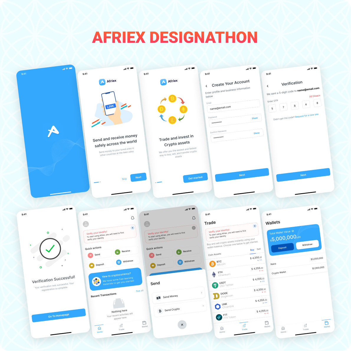
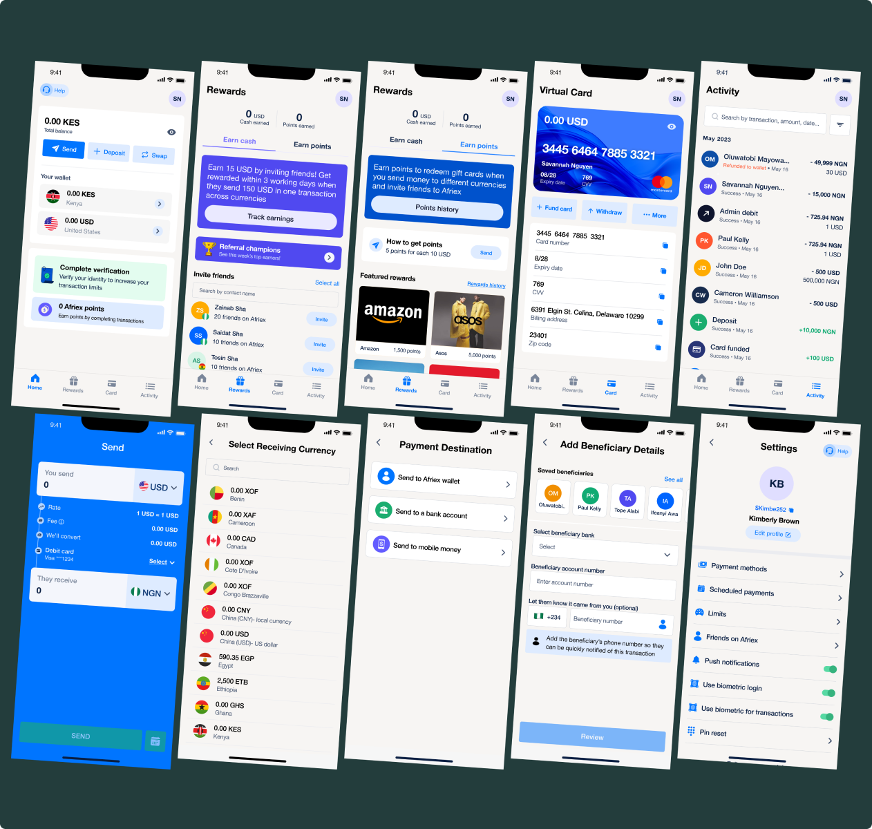
I joined Afriex after winning a design hackathon. Over three years as the company’s only product designer, I rebuilt every layer of the product that was making users hesitate, from first impression through post transfer confirmation, and built the systems that made that work replicable across multiple markets. Not by adding features, but by making every critical moment feel as reliable as the product actually was. The app store rating climbed from 3.6 to 4.8 in that time, and KYC completion rose with it.
Afriex ran a design hackathon. I entered, led the research, built the wireframes, and presented to the panel. My team won first place.
Months later, the CEO and Head of Product called. They'd been watching. The interview followed, and so did the contract.
What followed was three years of designing a fintech product that moved real money for real people across multiple countries: from broken flows to a full design system, from a consumer app to a business platform.
The product had traction. Trust was still being earned.
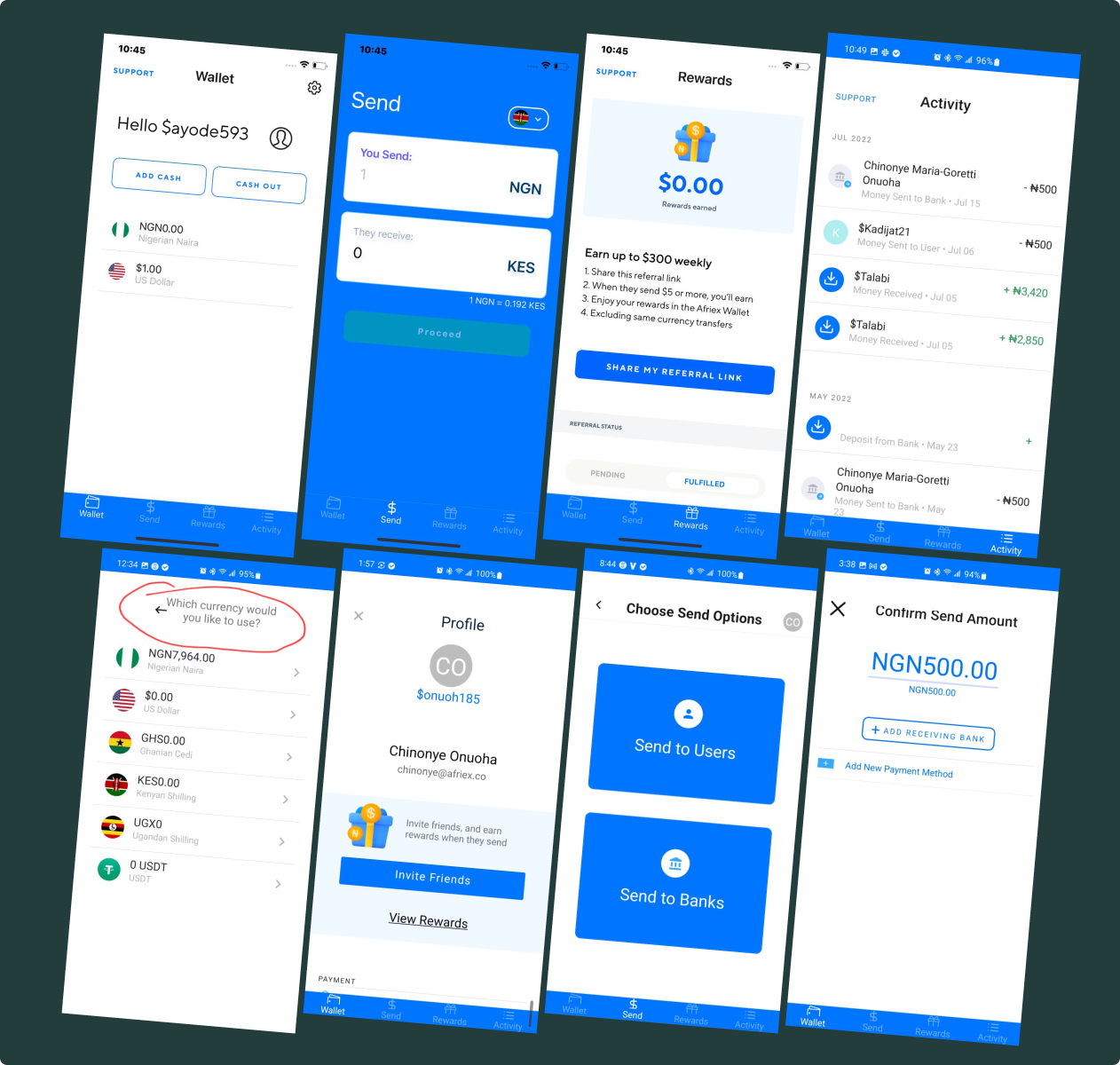
When I joined, Afriex had users and transactions. What it didn't have was a product that consistently made users feel certain at the moments that required certainty most. The interface was functional: signup worked, KYC ran, transfers completed. But every one of those moments left users with a question the product never answered.
Confident transactions weren't the norm
Completed transfers were generating support queries. Receipts confused rather than confirmed. Users were abandoning KYC mid flow, not because they couldn't verify, but because the flow made them afraid to continue.
Functional, but not reassuring
Every critical moment (first impression, identity verification, transfer confirmation, post send receipt) left users with an open question the interface wasn't designed to answer. The product worked. It just didn't communicate that it worked.
Growth without a design foundation
Afriex was expanding across multiple markets, each with different identity requirements, different trust baselines, and different expectations of what a reliable product looks and feels like. One design had to work across all of them.
This wasn't a feature problem
The question wasn't "how do we redesign screens?" It was: how do we reduce uncertainty at every stage of the user journey so people send money with confidence?
Research & synthesis
Six markets. One core truth.
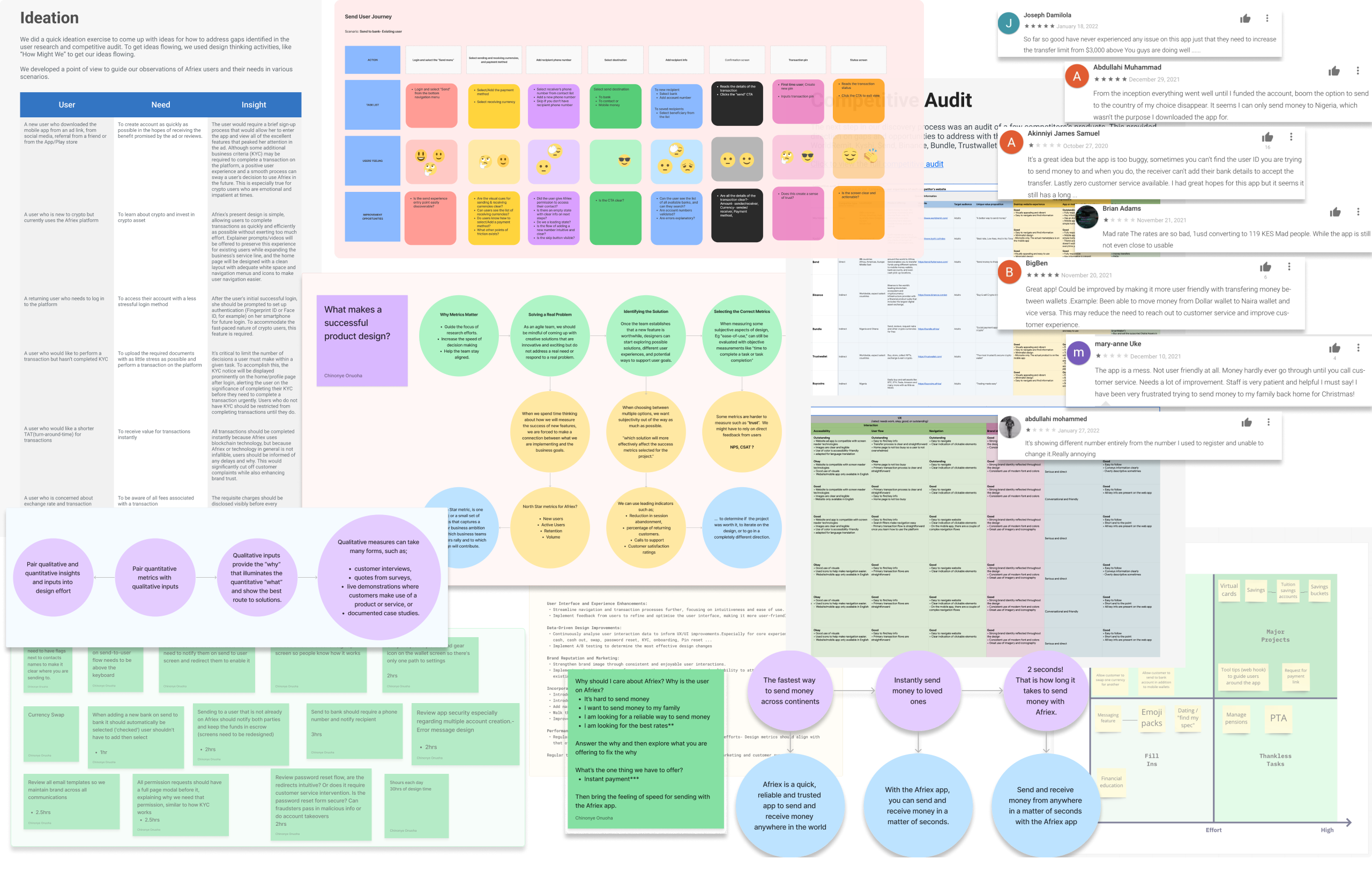
I conducted qualitative research across Nigeria, Ghana, Kenya, the UK, the US, and Canada. Different entry points, different contexts, but a consistent finding underneath it all: the product was functional, but not reassuring.
Competing with users' trust
Users were used to informal methods: cash, hawala, and bank wires. Afriex needed to build trust against these familiar options. The burden of proof sat in the design.
The issue was communication
Support volume stemmed from communication failures: ambiguous transfer status, unfinished verification flows, and unusable receipts. The product worked, but the interface didn't confirm it.
Trust builds in moments, not features
The insight that shaped every subsequent decision: trust builds through small certainties, not new features. Every redesign was assessed on one question. Does it increase user certainty or not?
Where I started
Design evolution
Strategic interventions
Not features. Decisions.
Every change I made was in service of a single question: does this make the product more trustworthy, more useful, or more sustainable? Here's how that played out across five areas: the core experience, security as UX, growth and retention, systems and culture, and the 0→1 business platform.
Rebuilding the core
The app had all the right pieces: onboarding, KYC, transactions, receipts. But completing a flow isn't the same as feeling confident you're doing the right thing. Afriex had the former; the latter needed work.
Mapping the end to end journey revealed the issue: not missing features, but moments where the interface stopped guiding users when reassurance mattered most.
I redesigned these core flows to reduce uncertainty at every critical step: from signup to sending money and confirming delivery. The goal was simple: make every step feel clear, guided, and safe.
Before
Signup had multiple fields all at once, providing no context and susceptible to friction
The login screen was a generic email and password form: no account recognition, no biometrics, no returning user experience
After
One task per screen instead of a long form, reducing cognitive load and abandonment risk
Phone verification first to establish trust early
Security checklist at the end so accounts are ready to use
Biometric login for returning users instead of repeated credential entry
The original onboarding flow started with a signup form, asking for personal data before users understood the product value or context.
I redesigned onboarding into a progressive single task flow: phone verification → identity → credentials → security setup, reducing friction and guiding users step by step.
Impact
Improved signup completion and returning user login speed. Users who completed onboarding arrived at the product fully configured with biometrics set, country selected, and account secured, reducing post signup abandonment.
Trade-off
Splitting one form into single task screens makes the flow feel longer on paper. I accepted that risk because abandonment clustered around cognitive load rather than step count, and visible progress kept perceived effort low.
Before
Verification introduced as a compliance requirement, not a user benefit
Users couldn't tell how many steps remained or which documents were allowed
After
Clear introduction explaining why verification is required
Identity confirmation broken into focused, single task steps
Messaging offering reassurance on privacy and processing time
Session replays showed hesitation and drop off at several points in the KYC flow. Users couldn't tell how far they were in verification, how much effort remained, or which documents were allowed, which made the process feel riskier than it actually was.
I redesigned the KYC flow to prioritise reassurance and clarity, turning verification into a guided sequence of steps rather than a compliance gate.
Impact
Lifted KYC completion rate across markets. Users now move through identity verification with clear expectations, visible progress, and stronger trust signals.
Trade-off
Explaining verification upfront costs seconds for users who would have completed it anyway. I took that cost deliberately: the users we were losing were the ones who did not understand why we were asking, and they were worth far more than the seconds.
Before
Transaction flow spread across multiple, loosely connected screens
Persistent bottom navigation created ambiguity about being inside or outside the flow
After
Send flow redesigned into a single, focused transaction process
Bottom navigation removed during the flow to maintain task focus
Clear stages from amount through confirmation with no distractions
Sending money is the core action in the product, but the original send flow introduced unnecessary friction. Users had to navigate through disconnected screens, and the bottom navigation remained visible throughout the flow. This created uncertainty about whether users were still inside the transaction process or navigating the app itself.
I redesigned the flow into a focused, step by step experience, guiding users from amount entry to confirmation with clear stages and minimal distractions.
Impact
Increased transfer completion confidence and reduced transaction abandonment. Users can now move through the send flow without leaving the task context, with clearer decision points and confirmation before funds are sent.
Trade-off
Removing the bottom navigation during a transfer locks the user inside the task, which is the point, but it demands a clear exit. I paired it with an explicit cancel path so leaving never meant losing work.
Before
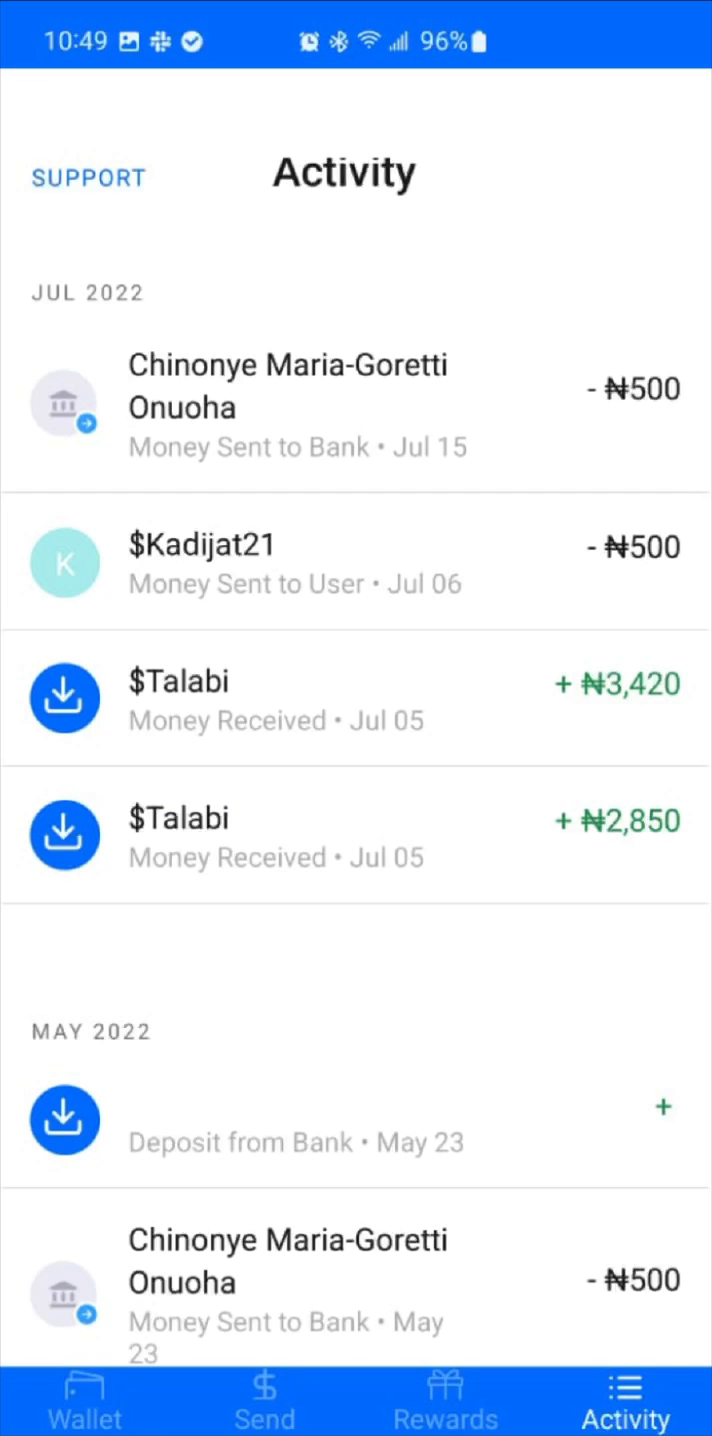
No visibility into transaction progress after sending
Users couldn't tell whether funds were processing or delivered
After
Receipt redesigned as a transaction status view with a timeline
Share and dispute actions give completion legibility and direct recourse
In cross-border payments, users rely on receipts to verify transfers and resolve disputes. The original receipt showed basic details but lacked context, leading to uncertainty and frequent support inquiries about the status of their money.
I redesigned receipts to function as a transaction status view, giving users clear visibility into where their transfer is in the delivery process.
Impact
Reduced support queries. The "Share receipt" CTA proved transfer success, removing the "did it work?" doubt. The dispute path provided direct resolution, reducing frustration. The timeline and status changes made the receipt a trusted reference.
Designing for trust
Before this work, high risk actions (sending money, withdrawals, and currency swaps) could be completed without authentication. This created a gap between user intent and system protection, increasing exposure to account takeover and fraud. Security existed at the system level, but not in the user experience itself.
I embedded authentication directly into critical flows: introducing a transaction PIN at the point of confirmation, and extending to biometrics for faster repeat interactions, with fallback paths to maintain access.
Transaction PIN
A dedicated PIN checkpoint at the exact point of confirmation
Deliberate pacing that signals the action is protected
Biometrics
Biometric unlock for trusted devices, with PIN fallback to maintain access
Fast for returning users, strict on protection
Impact
Reduced fraud exposure and strengthened transaction integrity, without adding friction. Users now experience security as a natural part of completing an action, not an interruption.
Trade-off
A PIN at confirmation is friction by design. The bet was that a deliberate pause reads as protection rather than annoyance in a money product, and biometrics kept repeat use fast. Completion held while exposure dropped.
Designing for growth
Growth wasn't just about acquiring users. It was about getting them to complete the actions that make the product valuable. I designed growth loops that reward high intent behaviors: onboarding others, funding accounts, transacting, and maintaining activity, while introducing features that encourage repeat usage and long term engagement.
The focus was consistent: incentivise meaningful actions, not just signups.
Before
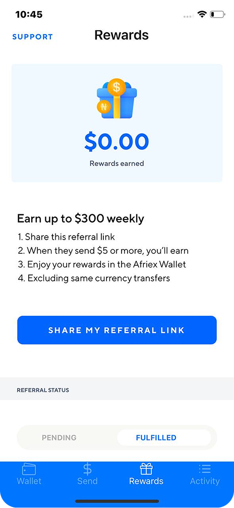
Static referral screen: rewards shown, but no path that reinforces activation
After
Rewards tied to real activation: a system that binds rewards, referrals, and reinforces user activation
The referral program moved from a passive banner to an active loop. Referring someone who funds an account and transacts reinforces the behavior that actually grows the product.
Impact
Referrals became a growth loop connected to funded, transacting users rather than empty signups.
Trade-off
Tying rewards to funded, transacting referrals slows the loop compared with paying on signup. It also protects the unit economics. Slower, cheaper, real growth beat fast, expensive, empty growth.
Virtual card
A low friction utility giving users a card connected to their wallet balance, extending Afriex's value beyond point to point transfers into ongoing daily spending
Virtual cards gave people a reason to keep a funded balance and use it, deepening engagement past one off transfers.
Impact
Introduced a new surface that keeps balances active, tying growth to ongoing utility.
Recurring payment
An automated engagement loop for repeat senders: the manual send becomes a set habit for people with consistent remittance obligations
Scheduled transfers were designed for Afriex's power user cohort, converting repeated manual sends into a dependable recurring behavior.
Impact
Turned the product's most valuable behavior into a habit rather than a chore for the users who send most often.
Credit builder
Extends value beyond transactions and builds long term user accounts
The credit builder gave long term users a reason to grow with the product instead of churning after a transfer, compounding value over time.
Impact
Improved activation and repeat usage by aligning incentives with behaviors that lead to successful transactions. Growth became tied to product value and user progression, not just acquisition.
Scaling design through systems
I operationalised design across the organisation, building systems, processes, and feedback loops that improved quality, speed, and decision making at scale.
Design quality wasn't the primary constraint: consistency and scalability were. Work was fragmented across features, feedback loops were informal, and there was no shared system to guide decisions or measure impact.
As the sole designer, I had to move beyond execution, establishing the foundations that allowed design to operate reliably across product, engineering, and the business.
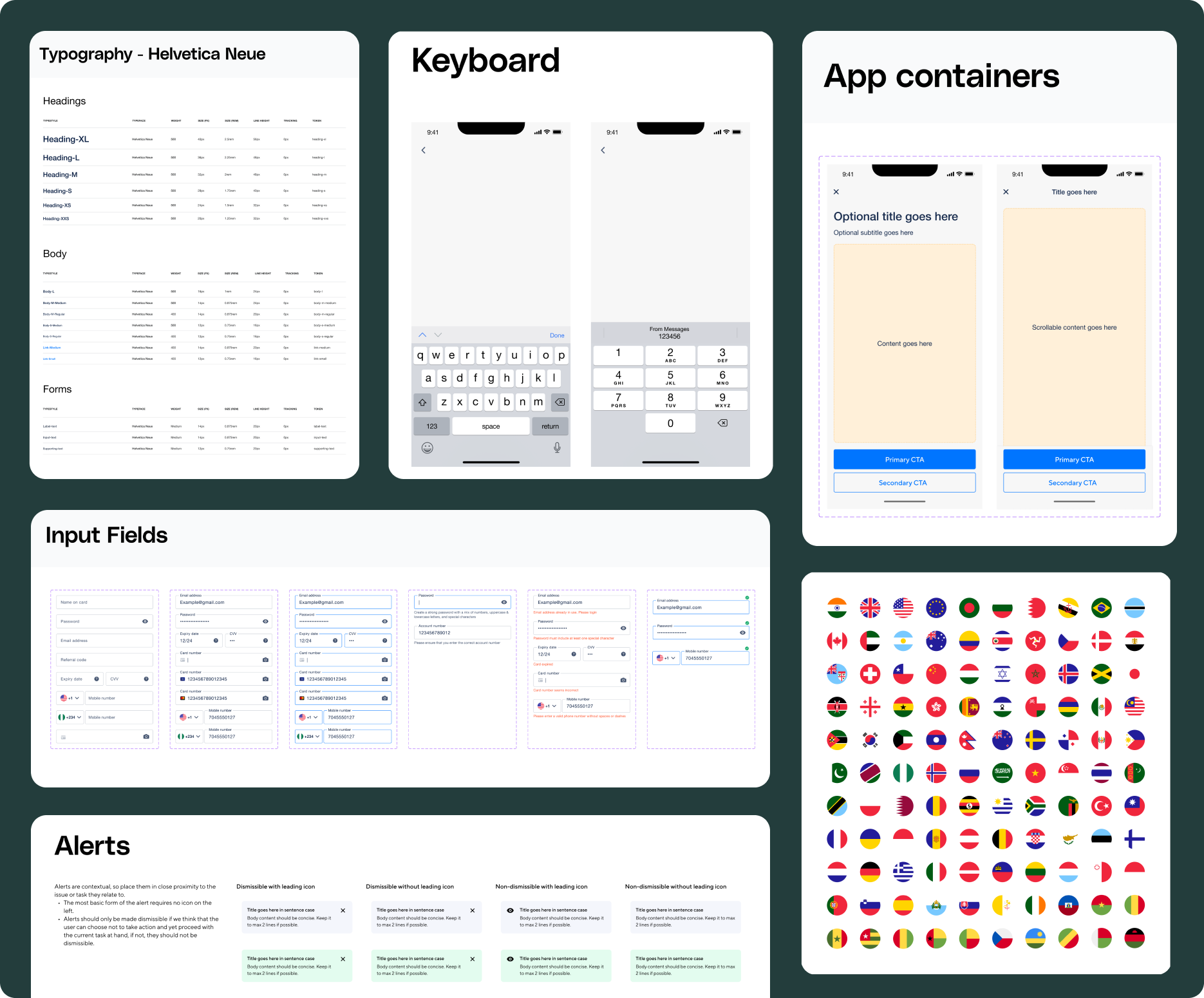
A reusable component library covering typography, spacing, inputs, and interaction patterns, so new screens compose from shared parts instead of reinventing them.
Impact
A reusable component system covering typography, spacing, inputs, and interaction patterns, reducing design inconsistency and speeding up delivery.
Trade-off
Building a system as the only designer meant weeks where no new feature shipped. I paid that cost early because every screen after it composed from shared parts, and the speed it bought never had to be bought again.
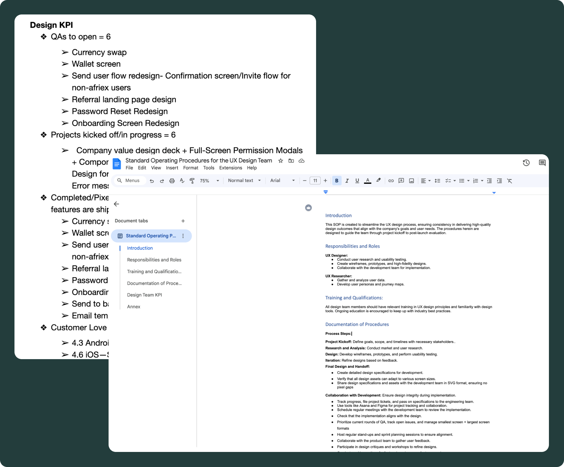
Structured design QA and metric tracking tied every shipped feature to a measurable outcome and gave design integrity a home in the release process.
Impact
Introduced structured QA and metric tracking to ensure design integrity in production and tie feature work to measurable outcomes, giving the team a shared definition of "done."
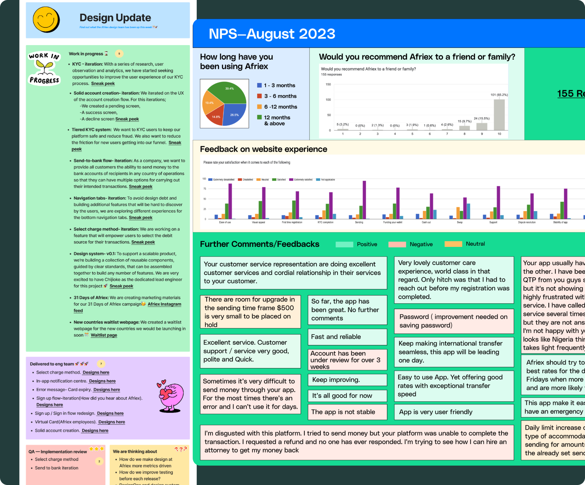
Monthly NPS and internal design updates kept user sentiment and design progress visible across the whole company, not just the product team.
Impact
Established continuous feedback loops through NPS and internal updates, making user sentiment and design progress visible across the company, and connecting product decisions to real user perception.
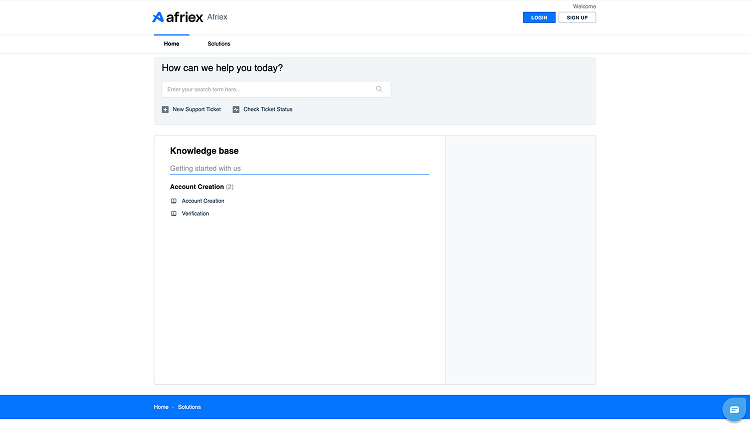
Before
A fragmented help experience: information hard to scan, ticket submission detached, login paths unclear
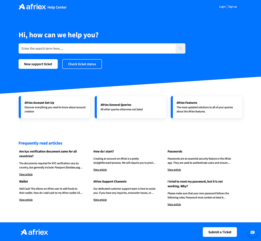
After
A structured self serve system: clear help content, guided actions, and one tap paths to resolution
As Afriex grew, support could no longer sit outside the product experience. Users needed a clearer way to find answers, raise issues, and track requests without relying on manual intervention.
I redesigned the support site to behave like part of the product: structured help content, guided actions users could complete on their own, and direct paths to a human when they needed one.
Impact
Improved access to help content and support actions, while reducing friction for users who needed answers quickly. The support experience now behaves like part of the product, not a separate escape hatch.
Building the business layer
As Afriex expanded, two gaps became clear. Internal tools couldn't support operational scale or visibility, and there was no structured product for businesses sending and managing funds. This created friction not just for users, but for the company's ability to operate and grow.
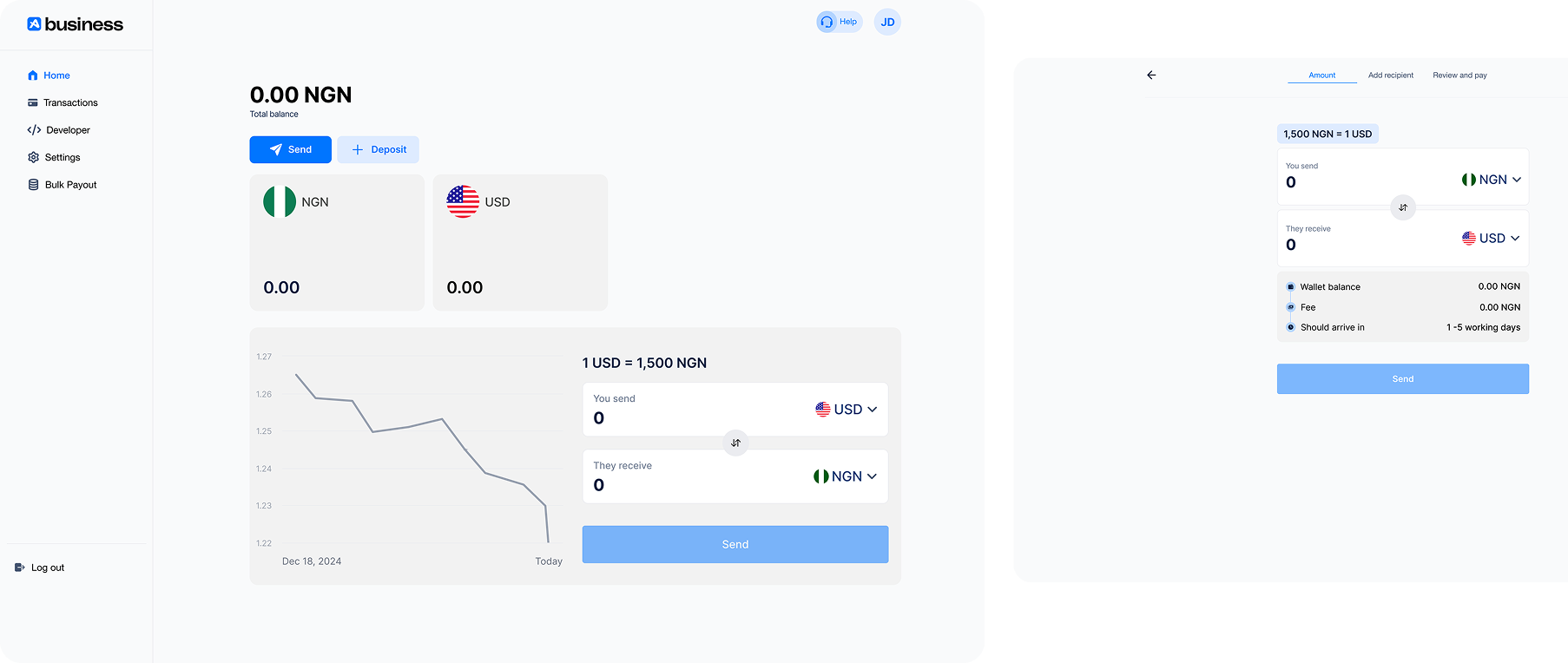
I partnered with product and engineering to define structure and workflows from scratch: data structures, transaction states, and edge cases. The result was a scalable admin dashboard, a dark mode system for internal teams, and the Afriex business platform (0→1) enabling businesses to send, manage, and track transfers with clarity.
This extended Afriex beyond a consumer app into a broader financial platform, improving internal efficiency while enabling new business use cases and revenue paths.
Defined a structured transfer workflow for businesses, breaking down complex, multi step transactions into clear stages, improving accuracy, traceability, and completion confidence for higher value transfers.
Impact
Established a new product surface for business users, enabling structured, higher value transactions and laying the foundation for Afriex's expansion beyond individual remittances.
Trade-off
Designing for businesses meant prioritising traceability and structure over the speed the consumer app optimises for. More steps, more confirmation, more record. For higher value transfers, slower and certain wins.
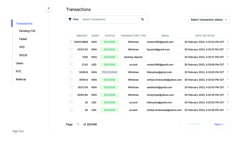
Before
Fragmented transaction views with limited filtering and poor scanability, slowing down internal operations
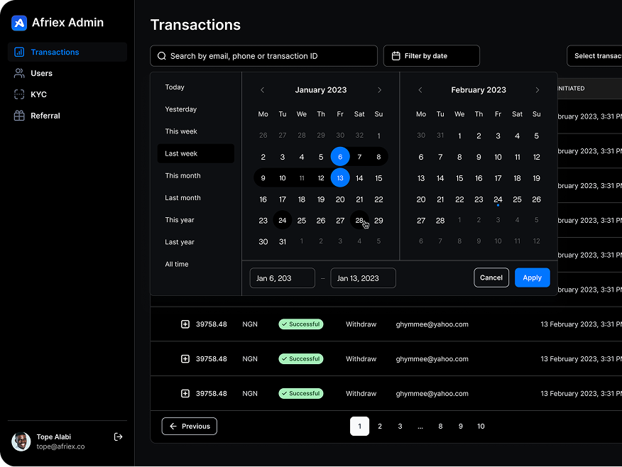
After
Structured transaction system with improved hierarchy, filtering, and status visibility, with light and dark modes
Internal teams work across environments and time zones, so the rebuilt dashboard shipped with light and dark modes and a transaction model designed around how operations actually investigates issues.
Impact
Improved operational visibility and efficiency by restructuring transaction data, filtering, and status systems, enabling faster issue resolution and scalable internal workflows, with light and dark modes for sustained usability.
Collaboration
Only designer. Never working alone.
Sole designer meant I owned the decisions, not that I made them in a vacuum. Every flow in this case study was shaped with engineering, product, compliance and operations, across time zones. Here is how that actually worked.
Worked withEngineeringProductCompliance and riskOperationsCustomer supportGrowthLeadership
Handoff
Specs engineering could build from without me
Every flow shipped with component states, empty and error scenarios, and edge cases written out. I documented my assumptions and a fallback for each one, so an engineer who hit a question at 2am in another time zone could keep moving instead of waiting for my morning.
This is where most of the back and forth disappeared. Fewer clarification threads meant fewer half-built screens that had to be redone.
Async
Recorded walkthroughs instead of meetings
For anything with real complexity I recorded a short walkthrough and posted it in Slack, so product and engineering could take in the reasoning and comment at their own pace. Three focused syncs a week covered what genuinely needed a room, and I shifted my calendar toward whichever time zone the week's priority sat in.
I also ran a design newsletter so the wider team knew what had changed and why, rather than discovering it in the build.
Co-design
Compliance in the room before high fidelity
KYC is where design and regulation collide, so risk and compliance saw the flows in low fidelity. Constraints shaped the sequence early rather than breaking it a week before release, and I learned to treat verification requirements as material to design with rather than a gate to design around.
The verification redesign in this case study came out of exactly that: it was shaped with the people who owned the risk, not handed to them.
Quality
Design QA as a joint session, not a checklist
I reviewed the build with engineering before release, triaging bugs together against the spec rather than filing tickets over a wall. It made quality something the team owned, and it made the next handoff faster because we had already agreed what good looked like.
Error states and empty states were part of that review, not an afterthought once the happy path shipped.
What it did to delivery
every 4 to 5 weeks→every 2 weeks
Delivery cadence for minor redesigns and bug fixes, after reusable patterns and a structured handoff.
5 to 7 months→3 to 6 months
Delivery time for major new features.
98%
Design system adoption across measured screens, using shared components and styles.
What I took from it
Compliance is a design partner, not a gate. Working with risk as collaborators rather than a final approval step changed what I could ship, and how fast I could ship it.
Consensus across time zones is mostly writing. Alignment came from stating my assumptions before anyone had to ask for them, not from adding meetings.
Being the only designer has a cost. Nobody senior was challenging the work, so the critique had to be built in through QA rituals and pulling other disciplines into reviews early. It is also why a design team is what I want next.
Outcomes
What moved, and how I know
I owned the product metrics weekly: activation, KYC success, referral conversion, and transaction success. So these are numbers I tracked myself, not ones I collected afterwards for a portfolio. Where something was observed rather than measured, I say so plainly.
3.6 → 4.8
App Store and Play Store rating over three years of iterative redesigns, sustained across releases.
40+
Markets served by the onboarding, KYC, transfer, and card flows I designed.
6
Countries of primary qualitative research: Nigeria, Ghana, Kenya, the UK, the US, and Canada.
3 firsts
The company’s first design system, first monthly NPS programme, and first structured design QA process.
KYC completion rose and mid flow abandonment fell once verification became a guided, explained sequence instead of a compliance gate. This was the metric I watched most closely, week over week, across markets.
Support queries about transfer status dropped after receipts became live status views with a timeline, a share action, and a direct dispute path. The question “did it work?” stopped arriving in tickets because the answer now lived in the product.
Fraud exposure reduced without hurting completion when transaction PINs and biometrics were embedded at the point of confirmation. Deliberate friction, placed precisely, read as protection rather than annoyance.
A new revenue surface opened with the 0→1 business platform and the rebuilt admin dashboard, extending Afriex beyond individual remittances into structured, higher value business transfers.
Three years. A few things stuck.
Trust is built in layers
No single screen builds trust. It's the cumulative effect of consistency, feedback, and reliability across every interaction, every market, every edge case.
Systems outlive any single feature
The design system, QA process, and metric ownership had compounding returns. The less visible work that made everything else possible.
Sole designer means product thinker
Without a team, you sharpen fast. You learn to distinguish urgent from important. The hardest part was deciding which trust gaps cost us users and which we could accept. That discipline of triage is what I'd carry into any larger organisation.